On HEY…

Since its launch last month, I’ve been swooning over HEY, the new email service from the creators of Basecamp. The service bills itself as an alternative to the data-reaping free email provided by Google and other big-tech companies. It’s opinionated and costly, two things that generally stand in the way of broader adoption, but by all accounts is doing quite well.
I can tell you that I’ve already subscribed to HEY, and that I’d recommend it to anyone open to the idea of paying for email. I acknowledge that changing your email workflow to something so different, after years of habit development, won't be easy and that some of HEY’s more opinionated decisions may turn off a large portion of the potential customer base. With this in mind, I wanted to share some of my thoughts on the email service without diving into a full-blown review.
Background
I’ve used a number of premium email services over the last ten years. I’ve used my domain for email, and required a place to host it. One of my principles when selecting a service is portability, and brining my domain to email gives me that portability.
The first, natural step was Google’s G Suite. G Suite is an easy to configure and use path to custom email domain hosting, with a familiar user interface. My issues with G Suite centered around privacy concerns and the terribly inconsistent integration with the broader Google ecosystem (you can’t use a G Suite account with Google Stadia, for instance).
The service I’ve used most consistently over the years is Fastmail. It’s affordable, reliable, and has the security and privacy features I require. It also has great tools to prevent landing in a spam folder, traditionally a challenge when working with custom domains. Finally, it works seamlessly with Apple Devices, even providing a configuration profile to quickly set up the accounts on new devices.
Finally, I recently tried Outlook Premium with their custom domain capabilities. Microsoft’s foray into premium email and self-managed domains was a dumpster fire that I wouldn’t recommend to anyone. Configuration was terrible (requires GoDaddy domain hosting), support took a week to assist me (the fact that I needed support for something so straightforward should tell you everything you need to know), and Microsoft’s injection of self-serving ads into the user interface of a paying customer was appalling.
Custom domain hosting brought me to these three services, but security and privacy were key contributing factors to sticking with one. Fastmail has proven, time and again, that they take privacy and security seriously, and with that have won my business.
Before I continue, it’s important to note that HEY does not yet allow for custom domains, though they say it should launch by the year. Until they do I will continue to be a Fastmail customer. I’m looking forward to this for sure.
Design and Workflow

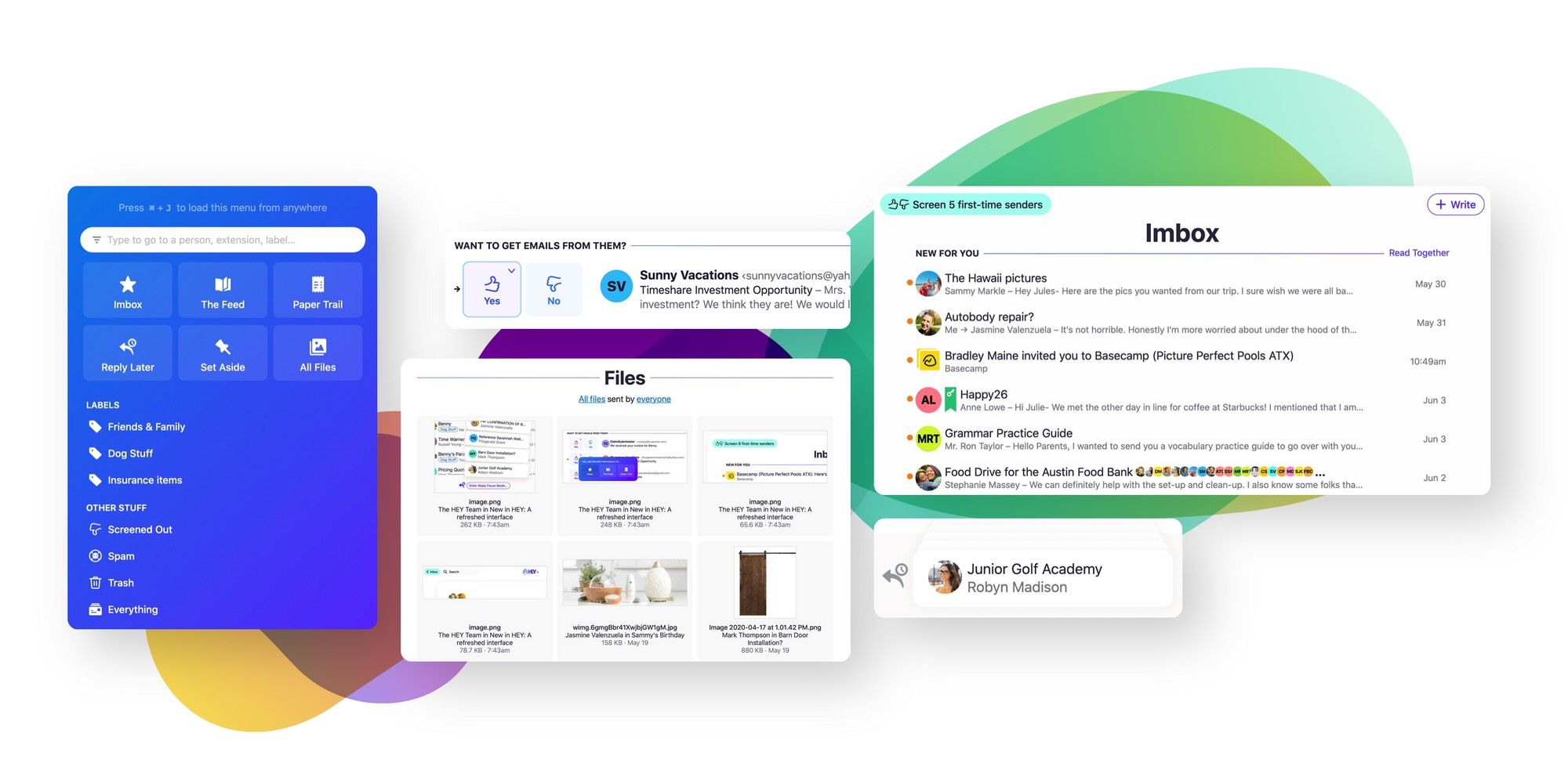
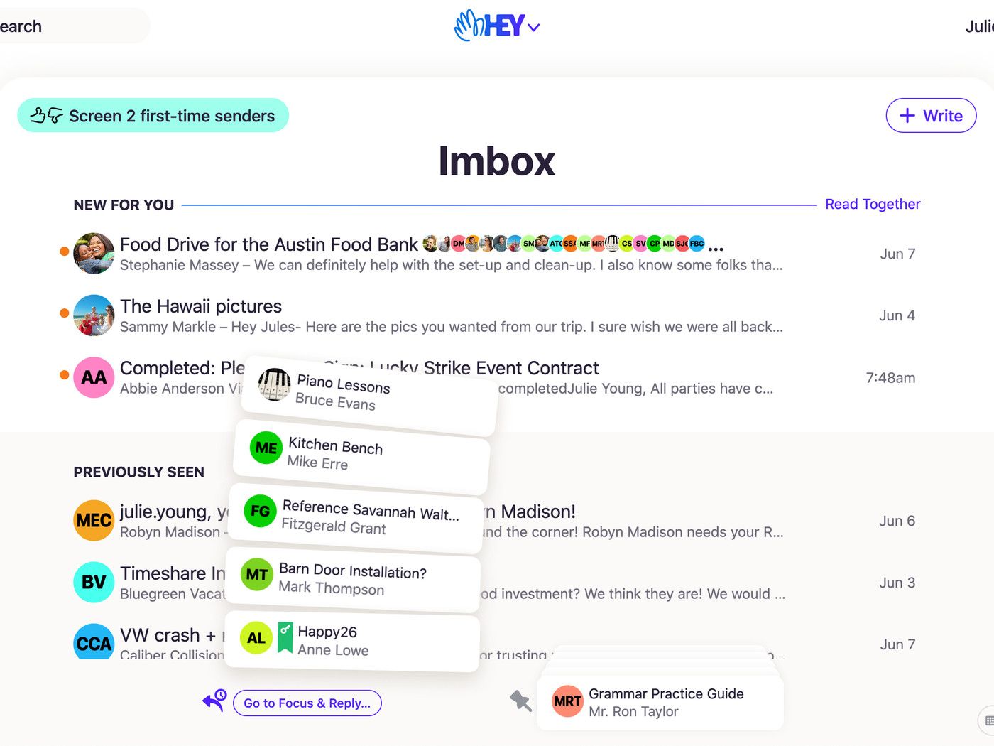
HEY’s design and workflow are extremely opinionated. The “Imbox” is a paired down, minimalist list of email that HEY, through a screening process, has deemed important to you. The rest of your email is tucked away in dedicated sections of the app. One section that HEY calls “The Feed” consists of all informational emails, like newsletters and marketing materials. The other, “Paper Trail”, is for those receipts and bills.
In my experience, the most frustrating aspects of HEY have to do with these two email destinations. Choosing which of these two buckets for an email contact (that’s the level of granularity HEY uses) to land can be anxiety inducing, as not all emails fit perfectly into these clean buckets. For example, my bank emails me to confirm when I’ve logged into a new computer. Does this go into the Imbox, or Paper Trail? Probably the Imbox, but what about the other email I get from my bank? Do they all use the same email address?
Next, there are no unread badges in HEY. Not for the Imbox, and not for the other lists throughout the app. This means that I find myself opening HEY for no reason more often than I opened my email before. When I dive into The Feed or Paper Trail, it takes a moment to orient myself and scan for new emails that have come in since the last time I opened the app. There’s no unread indicator here, leaving me to figure it out myself.
I’ve found that I really like the focused workflow of HEY, and I’ve also come to realize that I get very few truly important emails in my personal account. HEY also recently launched the ability to receive a push notification every time a new message makes its way to the Imbox, though there’s still no badge icon.
Having a dedicated place for newsletters and marketing emails also means I’m less worried about handing my email to sites. I can imagine The Feed augmenting or replacing RSS style newsreaders, though the lack of a “seen/read” indicator limits this. Finally, the recent explosion of Substack and newsletter publishing in general with a dedicated newsletter inbox for my email feels beyond serendipitous.
Quirks
Now for the quirks of this opinionated platform. The first and most disturbing, is the lack of standard email protocol access (SMTP, POP, IMAP, etc). There’s no way to read your HEY email from outside a dedicated HEY app. This, by all accounts, feels like a violation of what email is and contrasts with my principal of portability. Even Gmail, with it’s dedicated lists, has found a way to make these legacy protocols work.
To be clear, this decision makes perfect sense from HEY’s perspective. The features and functionality they’ve added require a consistent user experience. There’s no way to screen email in from iOS’s default email client, and navigating to folders from most email clients is an afterthought. Some privacy features, such as blocking tracking pixels, would also be challenging from outside a closed ecosystem, requiring HEY to modify the email to remove the spying functionality.
HEY is also missing features we’ve come to expect in email, such as signatures. Again, the design team has taken their opinion of signatures — that they’re bloated and wasteful — and made the decision for us that we don't want them. The HEY team has said some type of signature is coming in the future, but it will be character limited.
There are other quirks with this opinionated email client, and most are things that I agree with. The unique design decisions have ultimately improved the way I use email (with some light exception). Also, HEY is a young service that is evolving quickly. There’s nothing saying that they won't add IMAP or robust signatures sometime down the road.
Performance
In my experience over the last month, HEY is a delight to work with. Its apps are snappy, responsive, and consistent. I receive emails quickly and navigating the user interface is intuitive. Opening the HEY app on iOS is as fast as the default mail client, and features such as the ability to “set aside” emails and save them offline mean I haven’t had any issues when connectivity is lacking.
Conclusion
To summarize, I’ve enjoyed using HEY, and would recommend it to anyone willing to go through the pain of changing emails and, of course, paying $99 a year for a communication method that is widely accepted as free. Email is the key to your digital life, and privacy and security are at the core of ensuring you’re not the product or the victim. HEY goes above and beyond nearly every other consumer email service to protect users in this capacity. The recent launch of their Shield program is a great demonstration of that.
I’m looking forward to the launch of HEY custom domain support and family features. They’ve demonstrated the ability to ship new features and improve the service rapidly over the past month, and I can’t wait to see where the team takes it.
In conclusion, HEY has given me a reason to be excited about email. That, alone, is enough for me to invest $99 to support them.


Comments ()